Creative Development
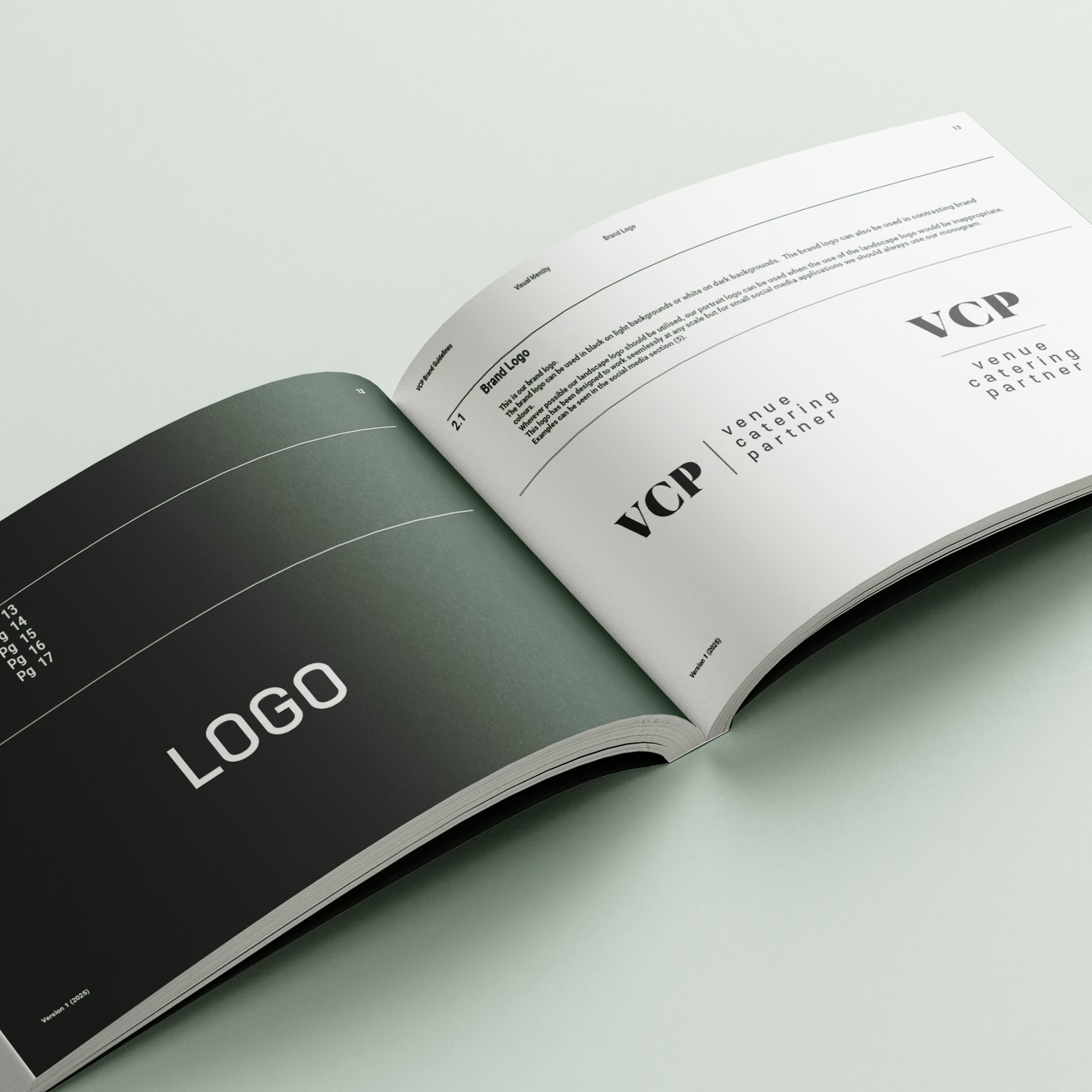
From here, we moved into creative exploration, building moodboards and visual routes. The chosen direction introduced a dual-logo structure that paired the full name with the well-known abbreviation ‘VCP’, giving the brand both gravitas and flexibility across touchpoints.
Typography choices blended tradition and modernity. Our serif and sans serif pairing, where we combined uppercase and lowercase, reflected VCP’s dependable, yet agile personality.
A Palette with Purpose
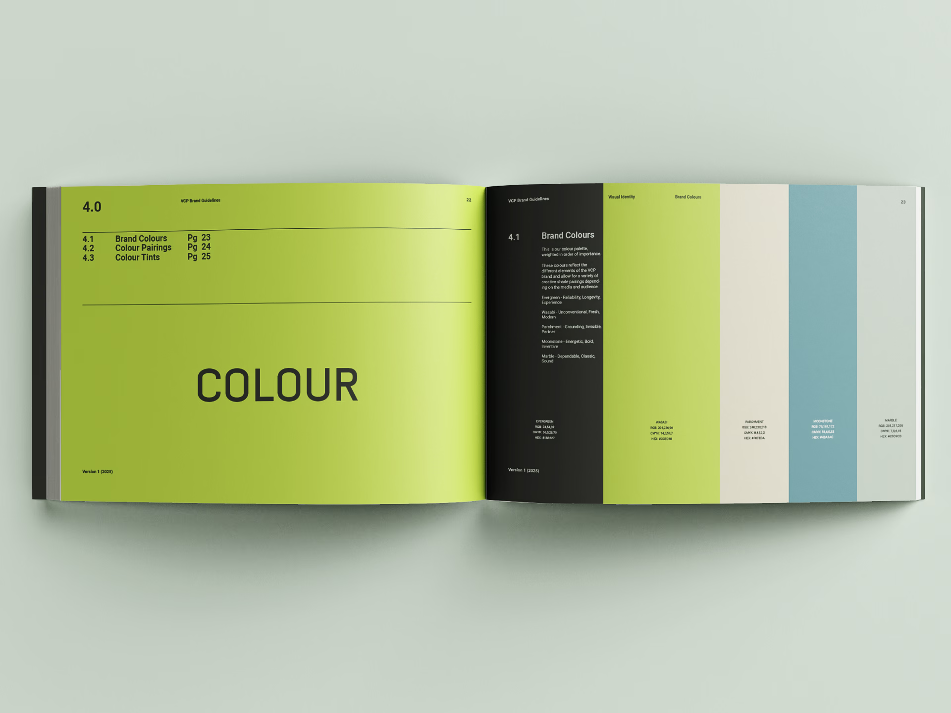
The new colour palette was developed with meaning. ‘Evergreen’ nods to reliability and experience, while ‘Wasabi’ adds a fresh, unconventional twist. Supporting colours like ‘Moonstone’ and ‘Marble’ provide those key neutrals and balance to the colour selection. Combined together, this ensures the identity stands apart from the corporate style typical of the sector.
We are proud to have delivered a cohesive brand identity that communicates confidence, approachability, and operational excellence—true to their tagline, “The Fresh Approach.”
Outcome and Impact
We delivered a full brand pack, including logo system, fonts and guidelines, ready for implementation across digital, print, and social. Our next stage of the project was to create a new website, made all the easier with such a comprehensive proposal for the VCP brand now in place.
This rebrand empowers VCP to tell its story with clarity, win new business with standout visuals, and strengthen alignment internally. It reflects a business with incredible sports and venue catering experience with modern presence.
Our Perspective
At Raccoon & Bear, we believe rebrands should do more than look good. They should build pride, drive growth, and reflect the heart of the business. More than surface level, it’s necessary to go much deeper into the philosophy of a company to ensure their brand reflects every facet of their operation. We appreciate VCP’s willingness to go on that journey with us and the stand-out simplicity of the new logo and identity bear testament to that investment.